Tender menu
Redesign the Point-of-Sale tender menu to support the high tender volume required by APAC markets, without disrupting the experience for the thousands of US and global retailers already using it
00

problem
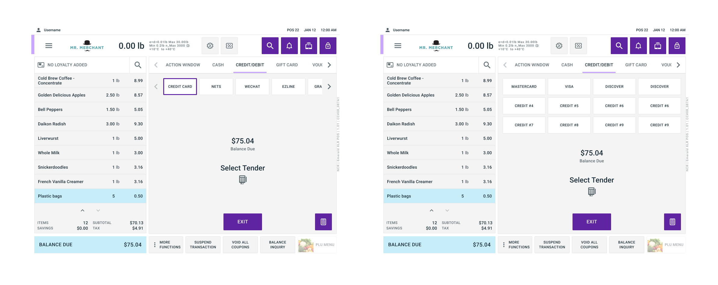
The existing point of sale tender menu used a horizontal scroll for secondary tenders. This broke down in markets like Thailand, where the sheer number of tender types made scrolling cumbersome and slow. But the menu wasn't APAC-exclusive; it was the same flow used globally, so any structural change risked disrupting muscle memory for cashiers already trained on the existing layout, across every retailer using our POS. The challenge wasn't just fixing APAC's problem; it was fixing it without degrading the experience everywhere else.
solution
I redesigned the tender selection from a horizontal-scroll list to a grid layout. This gave more visual space to critical information like currency amounts and let me remove space-heavy elements like large section headers that were taking up room without adding value, freeing up the layout to fit significantly more tenders without scrolling. Because of how many stores this would touch, I didn't move straight to final design. I started with a rapid A/B test to validate the grid direction early, then worked with the research team on a survey to pressure-test which usability factors mattered most before going further. From there, I ran three rounds of design and internal review, refining spacing, grouping, and layout based on that feedback, before handing the design back to research for a final round of usability testing (~10–12 participants globally) to confirm it before launch.
My Role
I led the design work end to end: designed and deployed an initial A/B test to validate direction under a tight timeline, then owned three rounds of design iteration based on survey and usability findings, working alongside the research team who ran the surveys and moderated usability testing.
Outcome
Usability testing showed a clear improvement: time to select a tender type dropped from 46.9s to 20.9s, and error rate dropped from 40% to 0%. Seeing the research and the redesigned layout — including the currency-sizing fix — brought NAMER on board, and the design launched globally rather than as an APAC-only fix.
year
2024
timeframe
30 days
tools
Figma, Usertesting.com
category
UI/UX
01
02