Flight
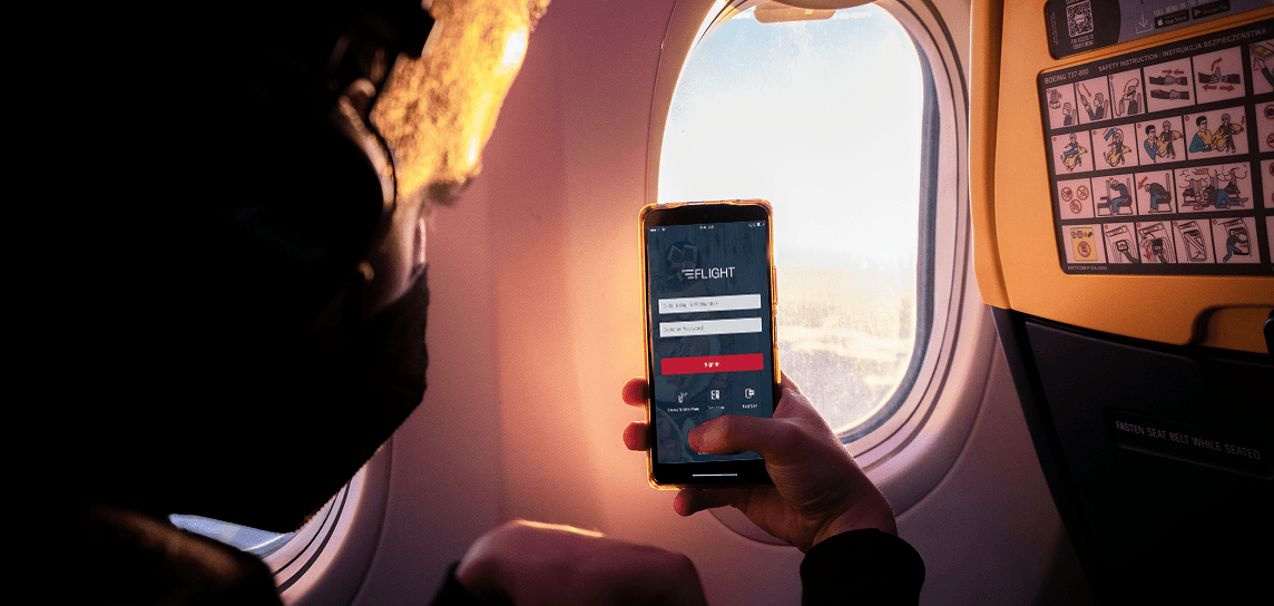
Windows to iOS Migration Redesign the airline's in-flight POS and guest services applications from Windows to iOS, driven by a hardware transition that came with a fixed, aggressive deadline.
00
problem
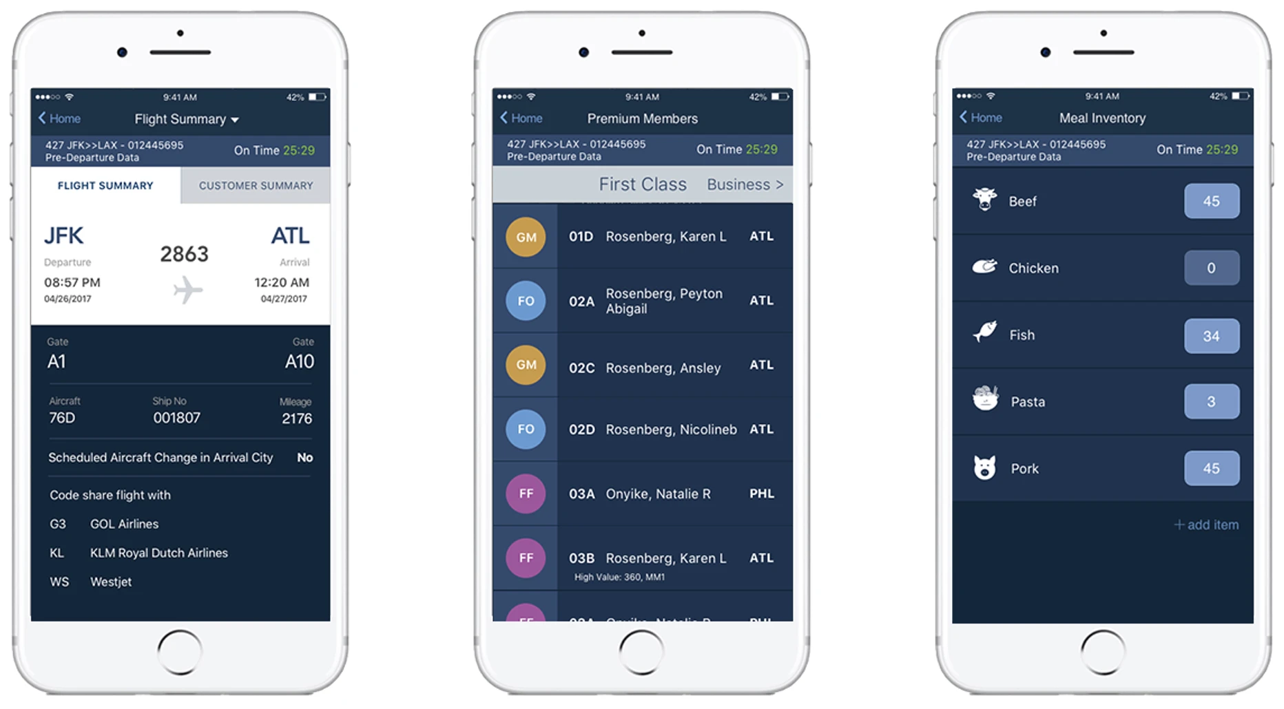
The client was moving off Windows hardware, which meant every screen in both applications had to be rebuilt for iOS on a fixed timeline, not a phased or exploratory redesign, but a full migration under real time pressure. The client's instinct going in was to preserve the existing flow as closely as possible to minimize rework, which put pressure against actually solving for iOS conventions rather than just reskinning Windows patterns onto a new OS. Some flows, like buying food and viewing passenger information, had deep, non-obvious hierarchy that didn't translate cleanly, and behaviors like back and delete actions worked fundamentally differently between Windows and iOS interaction patterns.
solution
The hardest design problems weren't visual; they were structural. Screens like food ordering and the passenger view required rethinking hierarchy that had built up over years in the Windows version, and interaction patterns like back/delete needed to be reworked to match iOS conventions rather than mimicking Windows behavior, even though the client wanted to preserve continuity. To get buy-in on the screens where I pushed for real change rather than a 1:1 port, I brought in iOS Human Interface Guidelines and best-practice examples directly into client conversations, grounding "why this needs to change" in Apple's own standards rather than personal opinion, which made it easier for the client to say yes to rework they hadn't budgeted time for.
My Role
I was the lead visual designer on a team that included three offshore designers and one junior designer. I scoped the full set of screens needed, distributed work across the team based on individual designer skill and speed, and built the core design file and pattern library the team worked from (in Sketch, 2018) to keep every screen visually and behaviorally consistent. I ran regular reviews to catch drift between screens and enforce cohesion across a distributed team. I was also the main point of contact with the client — presenting design problems, trade-offs, and wins directly to them throughout the project.
Outcome
The team shipped a full iOS redesign of both applications on time, while also identifying specific areas- the seating chart, meal ordering, and end-of-day flight attendant workflows- that were flagged as needing deeper UX work beyond what the timeline allowed. That backlog became the foundation for continued work on the app over the next three years.
year
2018
timeframe
20 days
tools
Sketch, Zeplin
category
UI/UX
01
02


